Boxing Day
Today's story in the New York Times, "What Lara Croft Would Look Like if She Carried Rice Bags," about the new "serious game" from the United Nations World Food Program, Food Force, shows how such games have managed to garner support from unlikely corporate sponsors, in this case from the beefy legions of the N.F.L.
In the game, a food crisis is brewing in exotic fictional "Sheylan," an island in the Indian Ocean much like Sri Lanka, which is suffering from the effects of global climate change, environmental degradation caused by the demands of an unsustainable regional economy, and an endemic civil war.
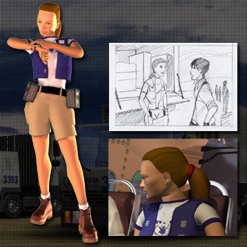
To minimize the crisis, the player can join a local nutritionist, a Brazilian pilot, a Nigerian food purchaser, or a ponytailed American logistics officer in Lara Croft boots and shorts. After a cursory briefing from the back of a bureaucrat's head and a depersonalized bank of video monitors, the player assumes the role of a U.N. rookie, armed only with a laptop.
With the exception of the truck driving ground logistics section, most of the tasks in Food Force required little dexterity or rapid reaction time. The Lara Croft character scolded me for my lousy roadside skills, but the other UN avatars were encouraging as I completed simple drag-and-drop manipulations of staple ingredients, shipping containers of food donations, and the components of a village master plan. Given the simplicity of the tasks, the choice to do any 3-D modeling of the virtual reality environment seemed a mismatch to the game's limited functionality. Variations of the same games in Flash exist on many government websites for children for considerably less development cost.
Food Force signals both "the game" and "the reality" of hunger in the headings on its main navigation bar. Ironically, the "reality" site often presents a more facile and less chaotic view of hunger crises around the globe than the game's gritty low-rez playscape. For example, the "reality" portion includes a photo gallery with only upbeat images of relief workers and grateful recipients.
(As a prime example of efficiency in information design, I am always partial to maps, but I thought that even the interactive map of Food Force gave relatively little information about the complex economic and political factors that contribute to widespread hunger.)
 There are other ways that hunger is wearing a corporate brand. A visits to the homepage of US AID (one of the few federal government pages with no children's website) shows how carefully the branding of US AID is policed on their website, with approved typefaces, colors, and compositions specified, and heterodox variations marked out for graphic shame.
The directives on imagery from US AID are particularly doctrinaire about the acceptable visual rhetoric for appeals for aid programs, as can be seen in the instructions below. (Click image to enlarge.) So, please no images of famine or genocide that "showcase despair."

Those interested in other U.S. branding efforts might find this site well worth visiting: America Supports You. These graphic materials, which are hosted on a U.S. military website, present easy-to-print logos for ball caps, coffee cups, t-shirts, and grocery bags.
Of course, the graphic standards manual of America Supports You warns against funny business like making the word "You" larger than "America" or "Supports" or the wise-acre use of green instead of the official blue on the heaving chest ribbon with the dog tag.
In other words, official government websites do much more than simply present a distinctive approach to visual rhetoric in their graphical displays of political ideology; now they also regulate possible counterfeit or otherwise illegitimate uses of the brand.
Labels: serious games
posted by Liz Losh at 12:52 PM
![]()
![]()

2 Comments:
I was interested to see that government websites are distributing free downloadable graphics. I've had free products on my Shakespeare site for awhile (designed to be printed onto iron transfers for tshirts or totes). And this morning, my son wanted a Joanna Newsom T-shirt like my husband's; we looked for the graphics on the internet and couldn't find them, so I ended up scanning Ken's t-shirt and then making an iron transfer. It's fascinating to see the concern with regulating these US-branded items -- after all, once you give them away, anything can happen to them!
I was fascinated by the branding theory and terminology embedded in the USAID branding program. (I checked out the links, too.) Many institutions control their branding and graphic identities. At UCI, for example, business cards follow a couple of strict templates. That's one reason I threw out my box of blue-and-whites and designed my own.
Post a Comment
<< Home