The United States of Remixing

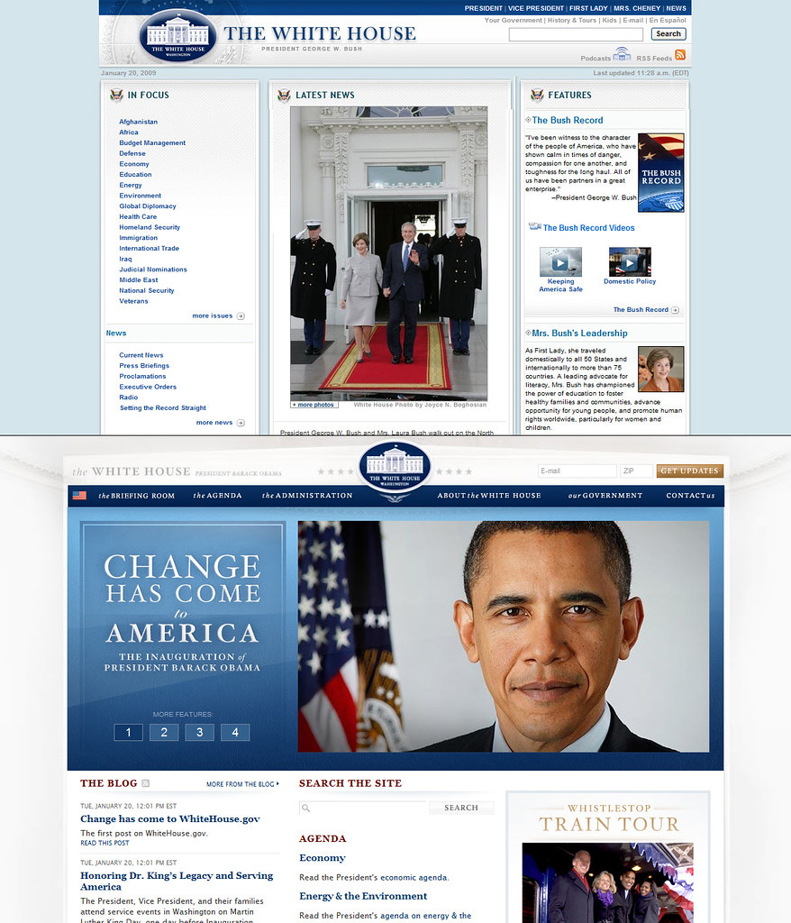
As someone who has been a regular visitor to Whitehouse.gov for the past decade, I feel that the jury is still out about how effectively the digital rhetoric of the site functions. Nicholas Kristof expresses enthusiasm for the site's blog, but I find the writing uninspiring, the tone stilted, and don't like the fact that so few of the entries have hyperlinks to relevant sources to provide context or lead the reader on pathways for future research. As glad as I am to see "Faith-Based Initiatives" disappear from the front page of the site, I'm also not sure that I like the navigation, which hides menus, ditches the familiar "F-pattern" in web design, and emphasizes iconic images rather than informative text. Most important, I find the links to commercial third-party sites that use proprietary software and depend on an advertising and marketing business model troubling, even if they have yet to place content on their Whitehouse.gov Flickr account.
In the good news department, it does look like you can download a high-quality mp4 file of the inaugural address, so let the remixes begin!
Labels: information aesthetics, White House

0 Comments:
Post a Comment
<< Home