Loser's Circle

So here they are, the winners of the 2006 Foleys, which recognize the incompetence of government agencies and policy makers in the area of digital rhetoric. (Insert drumroll here.)
Worst overall web design of a government website
It started parodically bad, it continues to be appallingly bad, and it seems like it won't cease to be bad any time soon. The prize for the all-around worst government website still goes to Ready.gov, which merits the recognition in a number of categories. The fact that they created a truly abysmal children's page this year that I slammed in July and threatened the Federation of American Scientists with a trademark infringement lawsuit because they made a critical counter site, which I covered in August, makes them worthy of the dishonor.
Worst online information access
Talk about a last-minute entry! According to a December 31st story on "Courts Rake in Fees for Web Access" in The Los Angeles Times, the County of Los Angeles should be the undisputed winner for actually charging usurious fees for searches of county records. Obviously the poor have just as much right as the rich to know if a doctor has a history of malpractice allegations or a contractor has a record of judgments for substandard work, but searches of public records net the county millions of dollars each year, even though neighboring counties don't charge for such searches.
Worst online social marketing
I asked social marketing expert Nedra Weinreich for her opinion:
My favorite remains the FEMA Kidz Rap, though the rest of the FEMA kids site is relatively harmless as federal kids' sites go. But FEMA also gets the award for worst offline social marketing (if you could call it that) for this program that I never got around to blogging, but have kept in mind as an example of what not to do.
Worst visual rhetoric
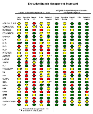
I'd give the prize for cretinous graphics to the Executive Branch Management Scorecard that comes from the White House, although -- as Ellen Lupton points out -- the White House generates plenty of other bad design from chaotic Photoshop backgrounds and banner ads to chartjunk and idiotic PowerPoint rhetoric.
Worst user interface
The website of the U.S. Citizenship and Immigration Services continues to be quite user-unfriendly, especially given the number of second language speakers who would logically be visitors to the site. I tried a few searches, and it seems to have not improved much from the condition that it was in last year. Imagine that you are an Iraqi citizen seeking political asylum, given the violent civil war taking place in your country, and you'll see how difficult good information is to find on the site.
I'd have to give the honorary second place award to the Transportation Safety Administration's Kafka-esque materials for people on their "no-fly list," which actually made the following statement on their site in March: "Please understand that the TSA clearance process will not remove a name from the Watch Lists."
Worst technical incompatibility
As the Washington Post pointed out in August, years after the September 11th attacks, the public still has yet to have the integrated computer system promised to the FBI by policy makers.
Worst electronic message to the masses
Of course, it has to be the suggestive instant messages sent to underage Congressional pages by Florida representative Mark Foley, who made his reputation as a crusader against online kiddie porn, although the "macaca" message of Virginia Senator George Allen on YouTube certainly merits a held nose as well.
Worst official PowerPoint presentation
I'd say the electronic slideshow about "Terrorist Use of the Internet" that was presented by experts from SAIC before the House Intelligence Committee was the worst this year, because -- in addition to being incredibly wrong-headed -- it was designed to create anxieties about domestic use of communication technology as well.
Worst government-funded videogame
I asked Ludology czar Gonzalo Frasca this question, who said, "I would say that by far the worst government funded game is the War in Iraq. And they're losing!"
I like the Federation of American Scientists otherwise, but I think the NSF-funded Immune Attack is probably the biggest unrecognized taxpayer turkey this year. Not only is this a classic example of "content stuffing" into a genuinely un-fun game, but the representations of microscopic body components are often wildly inaccurate in color, size, and behavior.
Worst abuse of copyright law
It's not technically part of a government organization, but the life of civil rights activist Martin Luther King is commemorated with a national holiday, so his heirs shouldn't be so protective of intellectual property associated with his legacy and so litigious, given that his words are part of our common national heritage.
Worst appeal to children
There were certainly plenty of bad government websites for children this year, but readers unanimously nominated the CIA's Homepage for Kids, when it came to bad government web design.
Worst call to patriotism
All the websites from the defense department are pretty uniformly terrible, since they don't acknowledge the sacrifices being made by over 3,000 soldiers who have already given their lives in Iraq. But this year's Defense Intelligence Agency Calendar is in particularly bad taste, so make sure to print out your PDF copy today.
Worst regulation of technology in response to a craven fear
Banning access to social networking sites in schools and libraries may be the worst regulation of a common technological practice in response to the bogeyman of the child sexual predator who was haunting House Energy and Commerce hearings all this year. The Deleting Online Predators Act may have many unintended consequences for those who depend on Internet service as a cheap alternative to long distance phone calls for the poor or as a way to access social services and other important cultural goods.
Labels: elections, institutional rhetoric, medicine, powerpoint politics

